Mental Moment
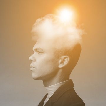
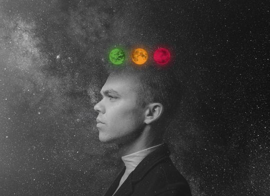
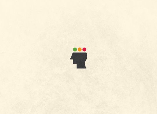
I had the privilege of making a logo for a friend who is developing a website that will provide inspirational, philosophical, and thought-provoking content. Due to its cerebral nature and the connotation of a brief pause, while sketching, I realized that an ellipsis combined with a face would be an appropriate answer to visualize the idea, “stop and think.” Color reinforces an additional allusion: the rhythm of traffic.


Colophon
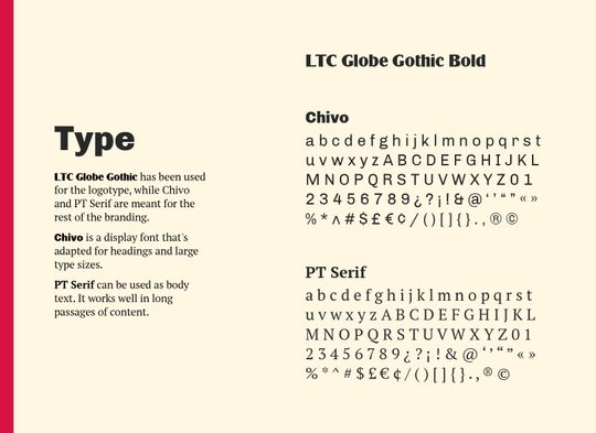
Type
- Chivo, LTC Globe Gothic, and PT Serif
Images
- “Simple Agenda Mockup.” Graphic Pear.
- Earth. NASA.
- “Man facing sideways” by Spencer Selover. Pexels.
- Mars. NASA.
- Moon. NASA.
- “Movietone news field staff Sydney, 1938” by National Library of Australia. Flickr.
- “Mug PSD MockUp #2” by Raul Taciu. GraphicBurger.
- “North American wild flowers” by Biodiversity Heritage Library. Flickr.
- “Pin Badge Mockup,” MockupsForFree.
- “Stars during nighttime” by Free Nature Stock. Pexels.
- “T-Shirt MockUp PSD” by Raul Taciu. GraphicBurger.
- “The Landing” by Brian Heimann. Unsplash.